
Hello, lovely blogland friends! I am really hoping many, many of you (even you lurkers :-)) will comment today, because I am in need of some decorating advice.
Remember my ho-hum stairway wall,

The one I want to turn into a gallery wall?
Well, I think I’ve rounded up all the frames/photos/art/etc. that I want to use, but I’m a little stuck when it comes to tying everything together. I saw a gorgeous stairway gallery in a magazine that used a ton of mismatched frames, all painted white or blue. Since I’m, ahem, mildly fond of white and blue, this seems like a good idea to me. The colors would flow nicely with the living room colors, plus I have a stockpile of blue and white paint of hand. Here’s the problem, I can’t decide which frames should be which colors and if they should all be the same shade of white and the same shade of blue.
Here’s what I’m working with, keep in mind that I’m going to reprint all the photos in black and white – please feel free (and encouraged!) to comment with your color choice for any and all frames.
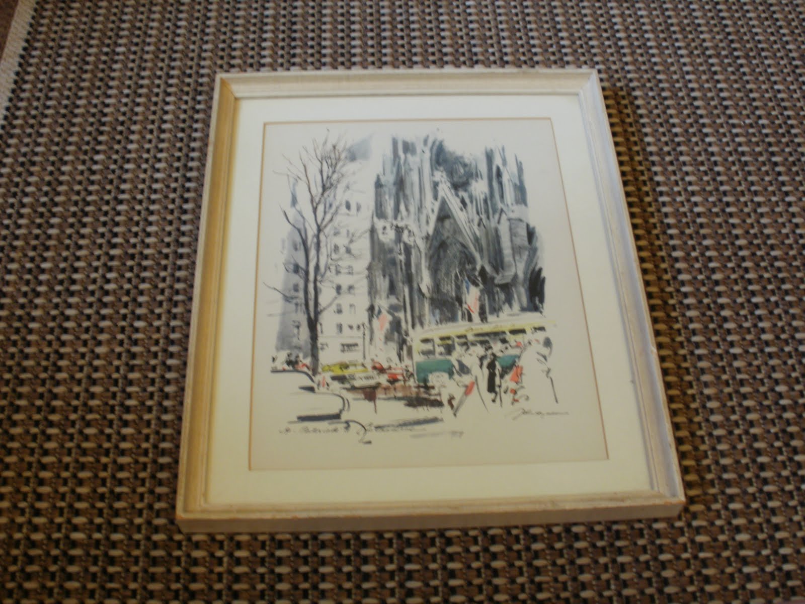
Frame #1

Ick, I’m very over the roses on this dollar store frame. I think I’d be happy with it in either white or blue.

Also a dollar store find. It’s already a very pale shade of blue…should I keep it, or paint it the slightly darker shade I have in mind for the other blue frames?
Frame #3

This is a super nice frame, but it’s more of a cream than a white. The question again is, should I make it a truer white, or leave it alone?
Frame # 4

Part of me thinks this would look awesome in blue and part of me thinks that it’s a really nice frame and it might be cool to have a little silver in the mix. Or, it might stick out like a sore thumb….one of these things is not like the others…
Frame #5

I’m pretty sure this frame will look awesome either way, but white with a little distressing to show the black underneath could be pretty cool.
Frame # 6
This is already white-ish, but it’s not a very nice frame and I think a fresh coat of white paint would really make the art pop.
Frame # 7

So these vintage street maps of London don’t have frames yet, but I’m going to pick up some wooden diploma frames from the dollar store that will fit them perfectly. I think I’m leaning more towards blue for these.
Frame # 8

Not really a frame, but my faux metal sign letter. This will be staying as is.
So what do y’all think? Clearly, I need some help to cure my indecisiveness!
<3
Hattie
4 comments:
1. White.
2. Painted Blue
3. Painted White
4. Definitely painted. I'm thinking blue.
5. Yup, white distressed
6. White or blue (to bring out those little blue bits in it).
7. I'd say blue too
1,5,6,7 - Blue
2,3,4 - White
I think your "S" looks cool as is.
Just a thought!
I'd paint 1 and 4 blue.
I'd leave 2 lighter blue.
I'd paint 3, 5, and 6 (distressed is cool) white!
I think the maps will look amazing with blue frames.
And your "S" is amazing!
Good luck! Can't wait to see it done.
I think the frames should all be painted the same color, either white or blue. But the S can stay blue if the frames all go white. It would tie them together a bit more since the frames and pictures are all different.
But then, I'm still struggling with our "gallery" on our bedroom wall!
Post a Comment